CONTACT
Anamnesis Counseling Center
Client Work: Branding and Website
Aug. 2026
Ohio-Based
Anamnesis Counseling Center is a private Catholic counseling practice in Ohio. I created its brand and its website, so everything a client sees feels like it comes from the same place.

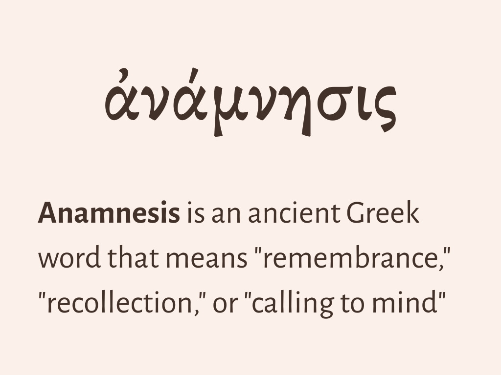
Anamnesis is a Greek word for remembrance. In counseling it also means a person's own history, the story a counselor listens to first. Looking back honestly at where you've been is a big part of recovery, and the name puts that idea at the center of the practice.
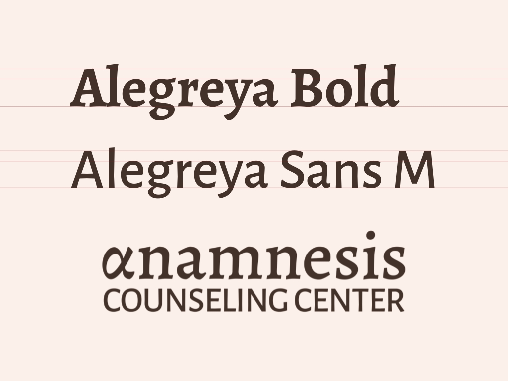
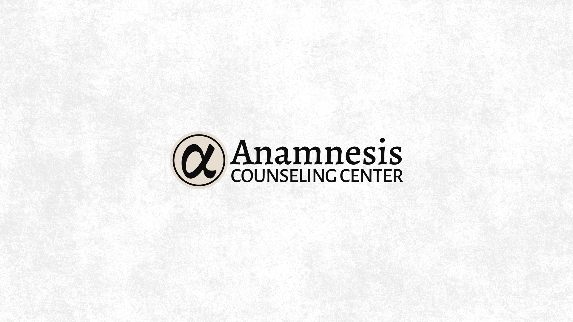
The name is set in Alegreya Bold, with Alegreya Sans for "Counseling Center." Alegreya is a serif with a handwritten feel, which keeps the name warm and human instead of clinical. The sans version pairs with it, so smaller text stays easy to read on the website and in print.
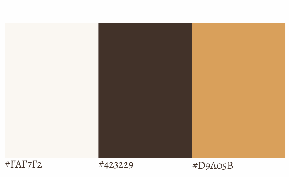
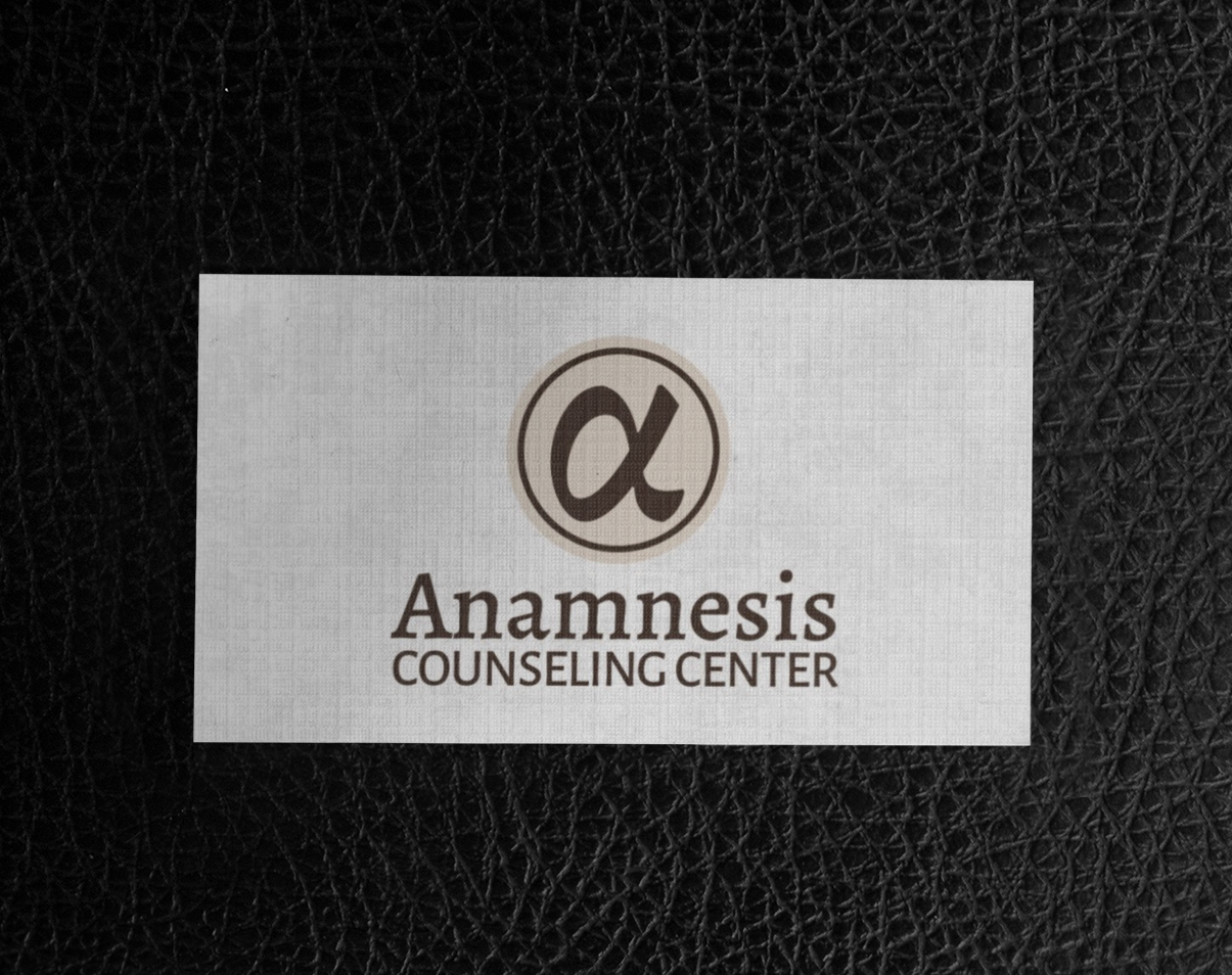
The palette is a soft cream, a deep brown, and a golden tan. They're warm and earthy, so the practice feels calm and welcoming, and the dark brown keeps text easy to read on the cream.
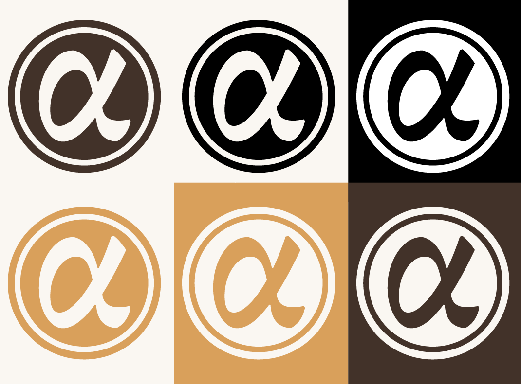
The emblem is the Greek letter alpha, the first letter of Anamnesis, set inside a circle. It works as a simple mark on its own, and I made six color versions so it holds up on light, dark, and gold backgrounds.
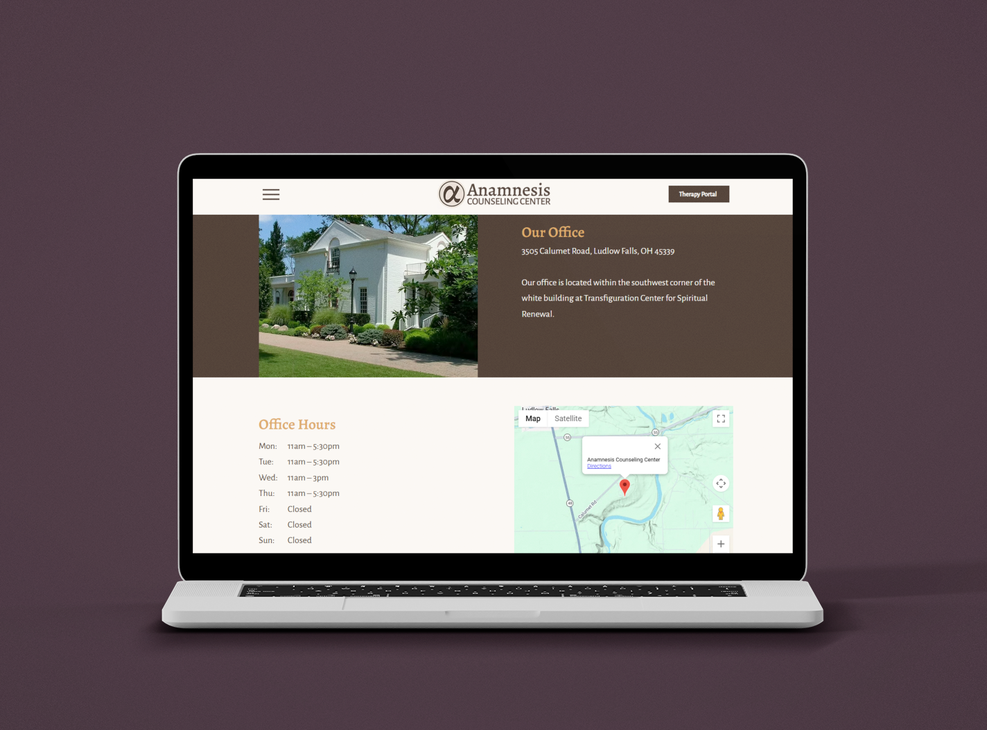
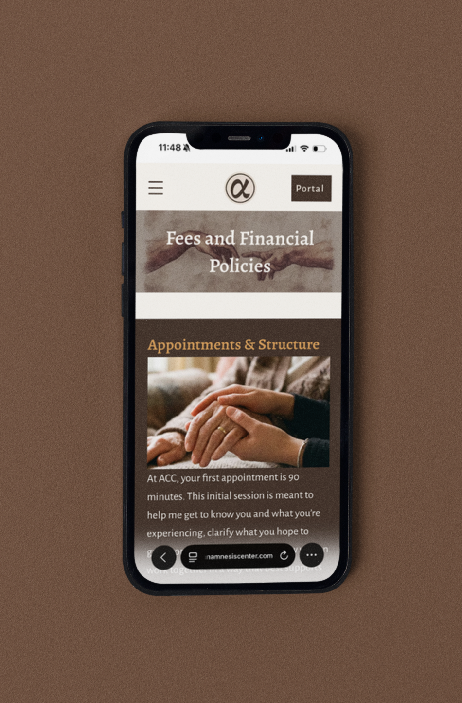
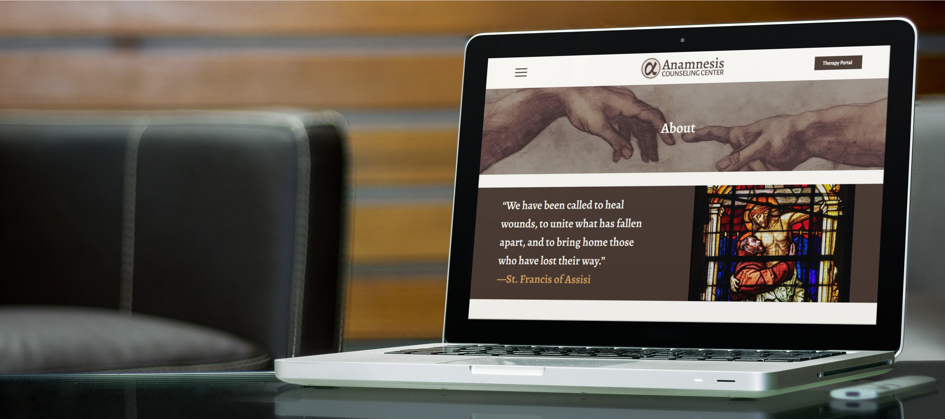
I designed the website so the brand carries through to the first place most clients will meet the practice. It answers the practical questions up front, like fees and what to expect at the first appointment, and it links to the client portal.
VISIT ANAMNESIS WEBSITE ↗