CONTACT
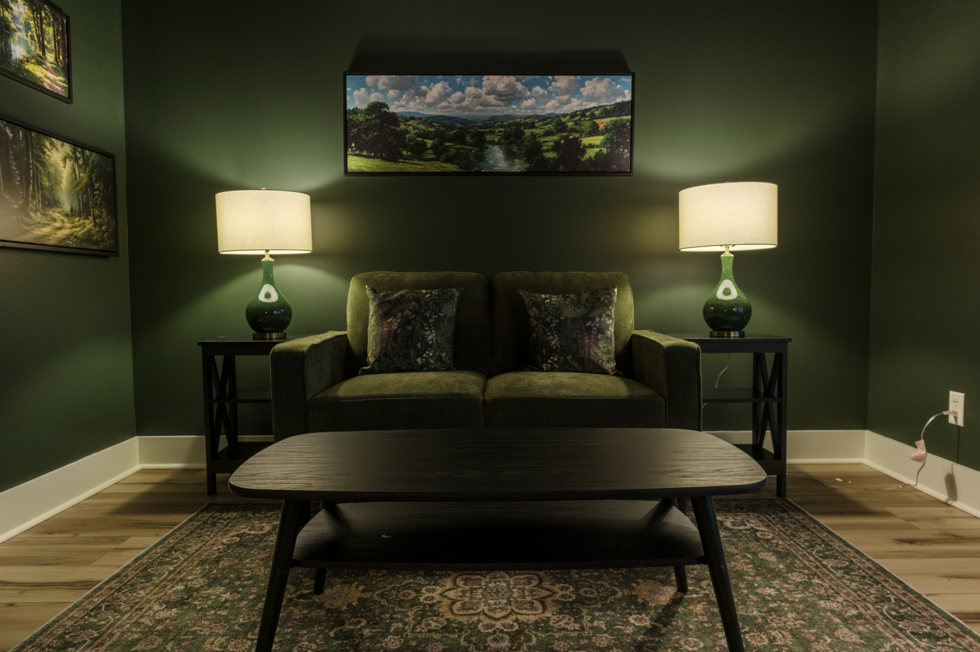
Everlasting Hills Counseling
Client Work: Branding and Website
Spring 2026
Over the span of a month, I created a full brand kit for the counselor behind Everlasting Hills Counseling. The brand also reflects his Catholic faith, which is part of how he practices.

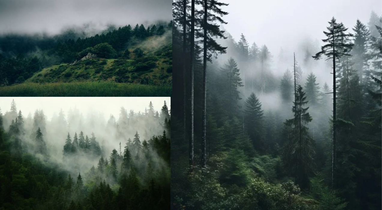
The practice's theme comes from dark green, foggy forests and hills. I built the brand around that idea so it welcomes clients into the journey of self-discovery before they ever walk through the door.
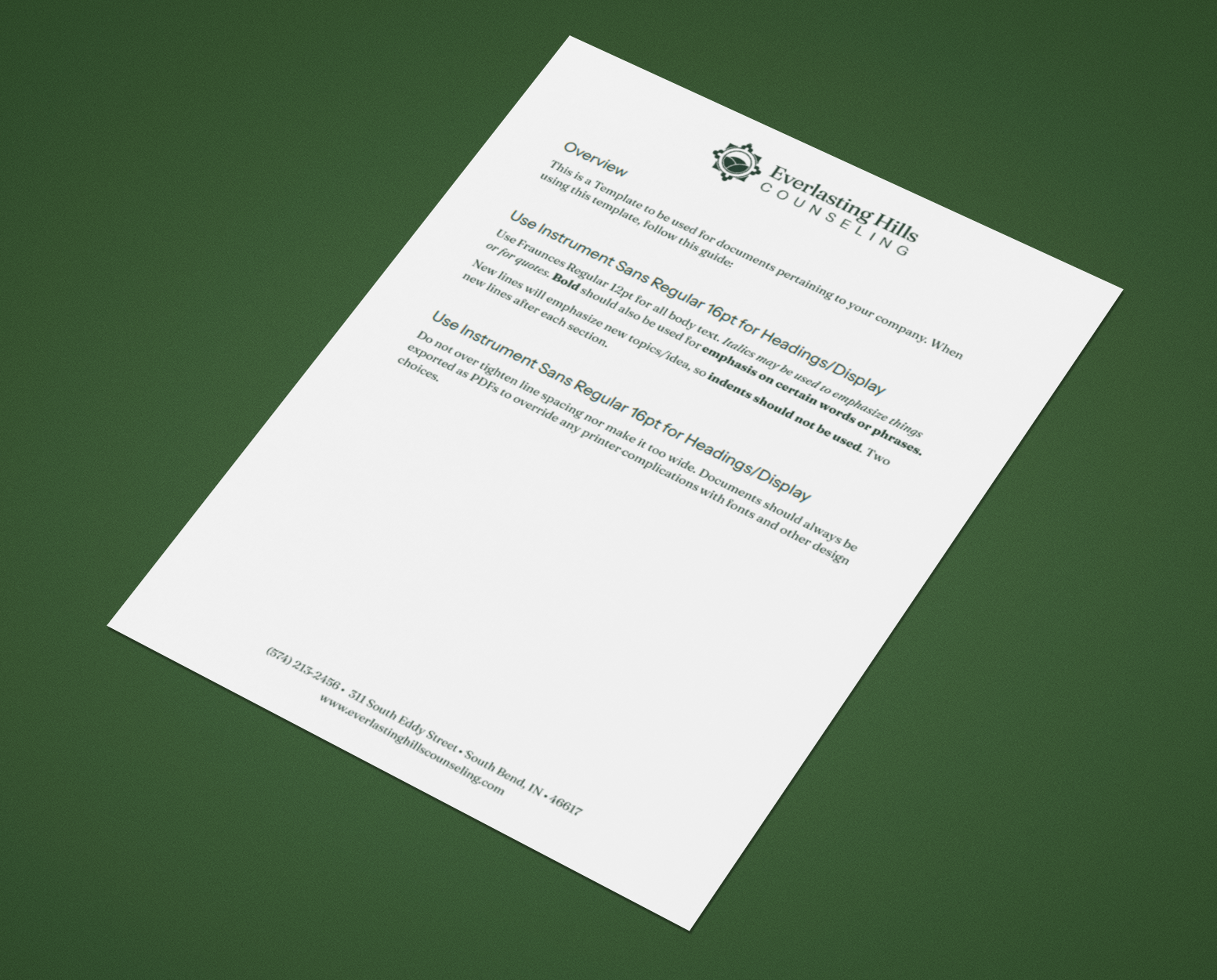
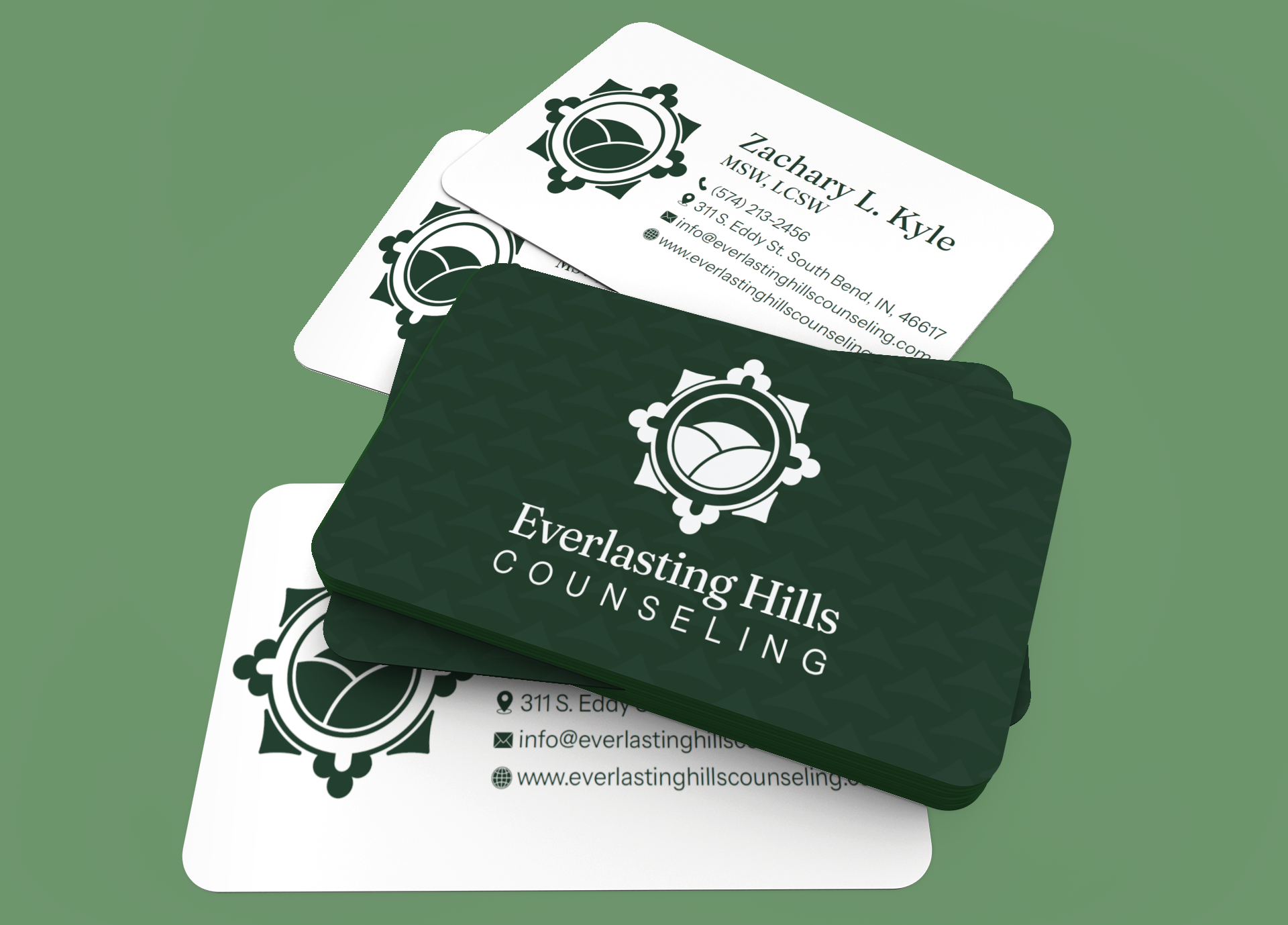
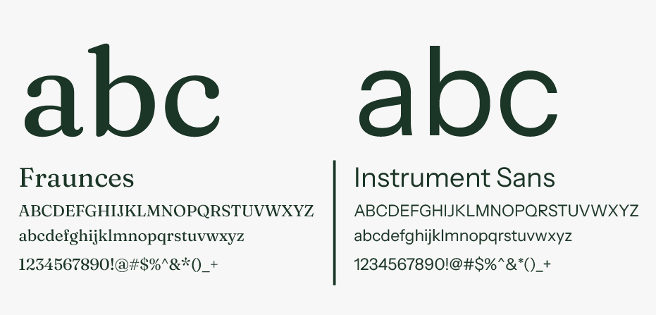
The type had to feel welcoming and grounded, not clinical. I chose fonts that stay readable on the website, the letterhead, and the business card, so the practice looks the same everywhere clients meet it.
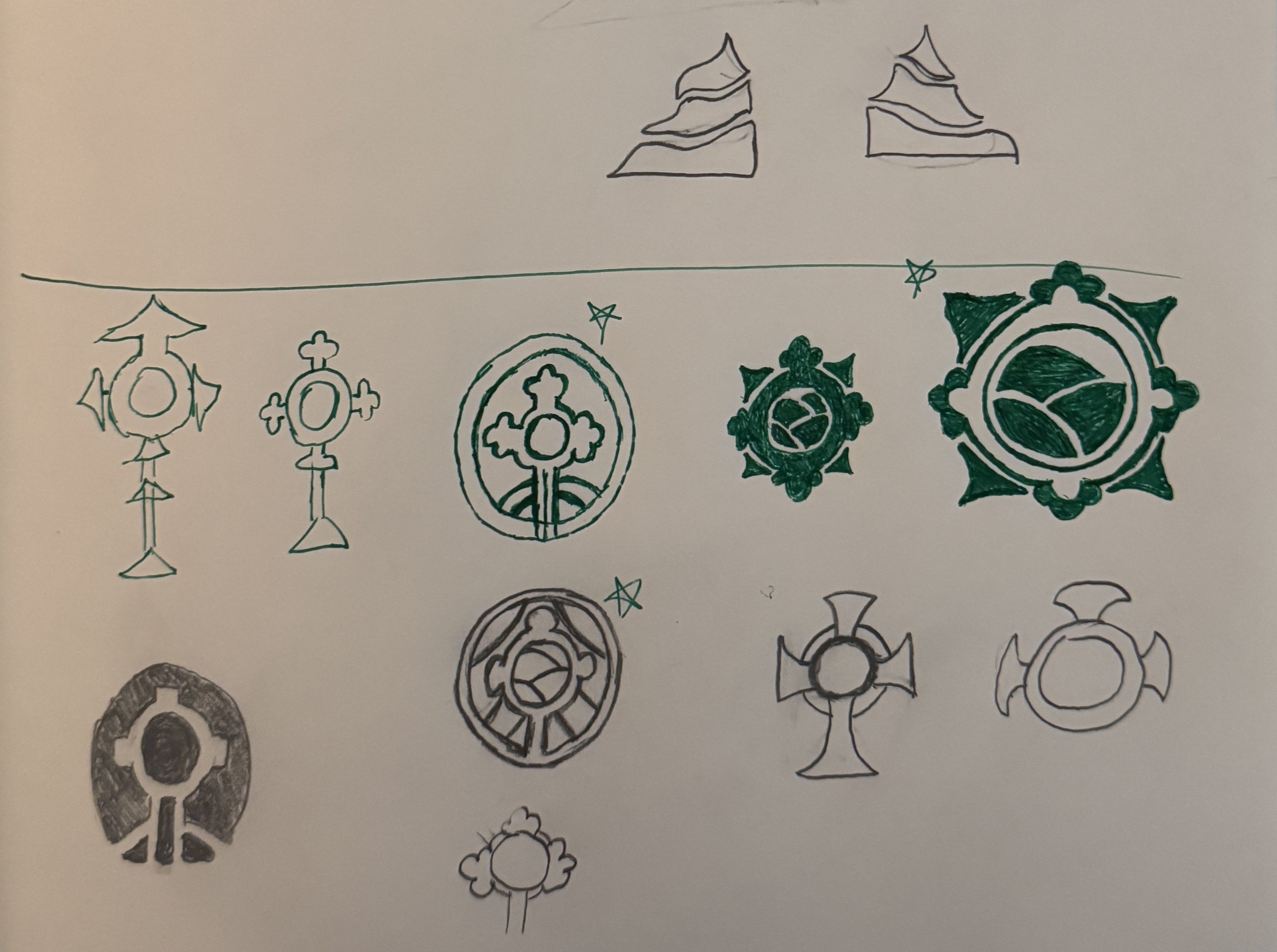
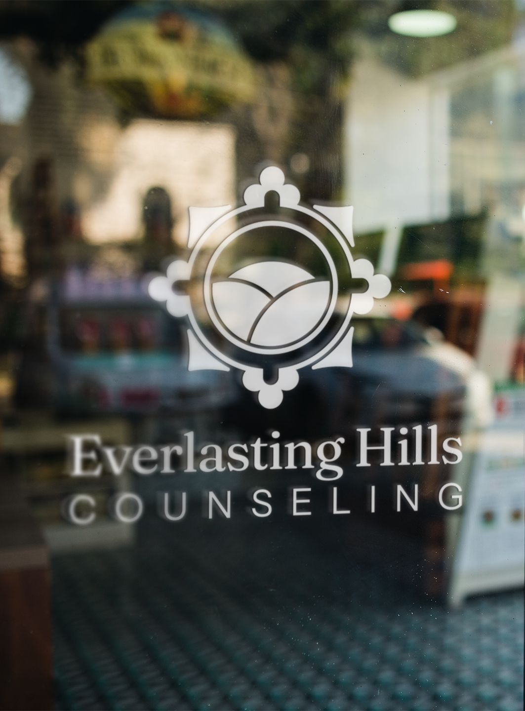
I started with sketches, exploring how the hills and forest theme could become a simple, lasting mark. These early directions led to the final logo.
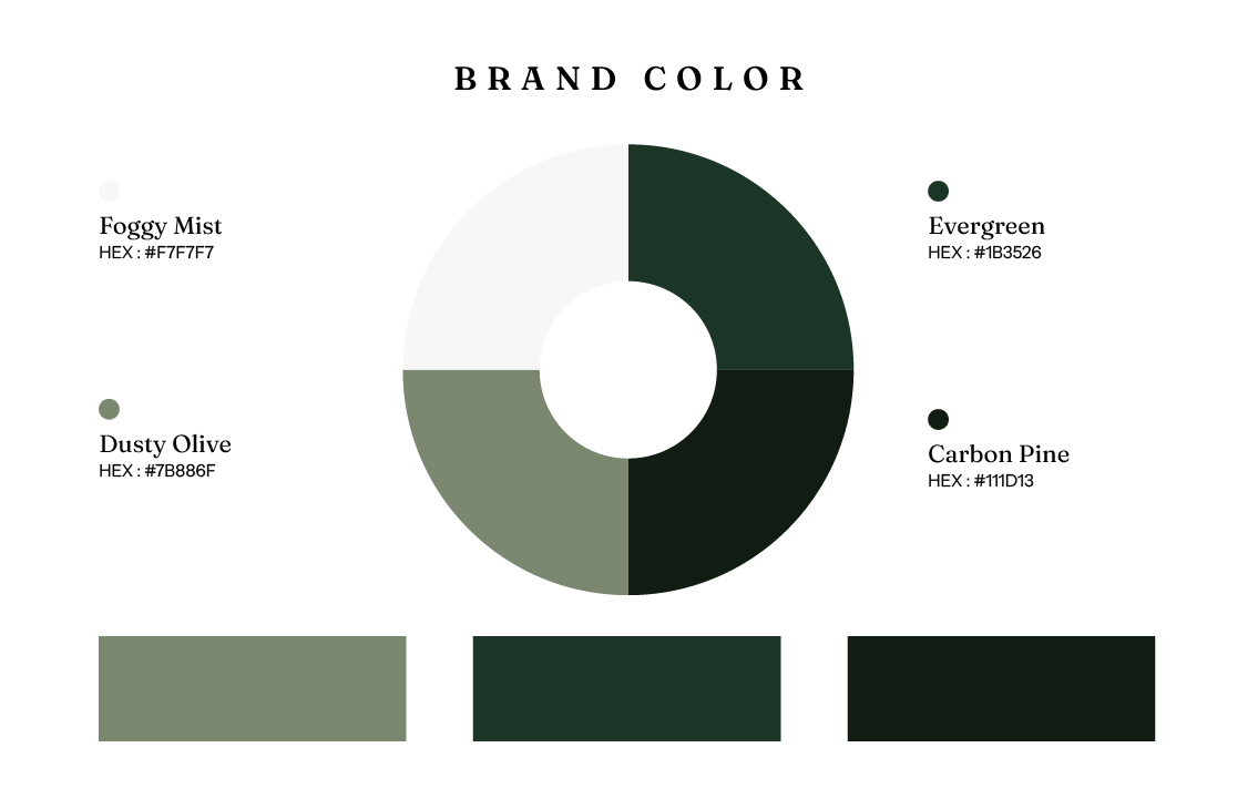
The color palette draws from the natural environment of dark green forests and misty hills, creating a sense of calm and stability that aligns with the practice's values.
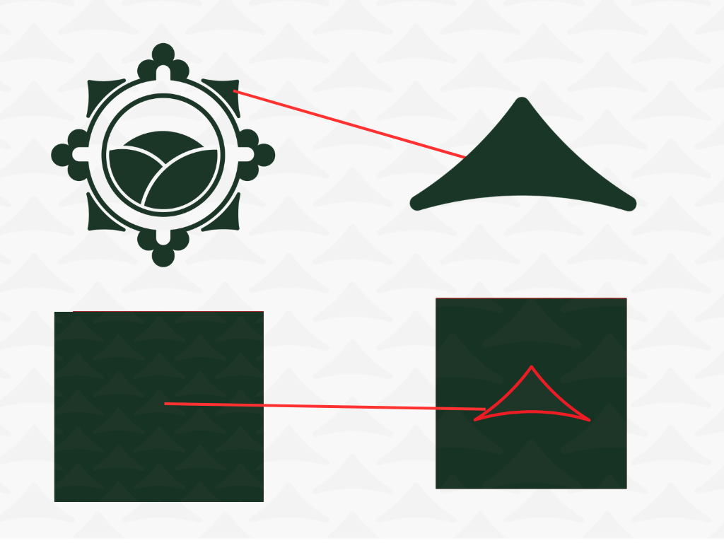
Next to the main logo, I designed a pine symbol that works on its own. It carries the forest side of the theme and gives the practice a small, simple mark that can be used independently in various contexts.
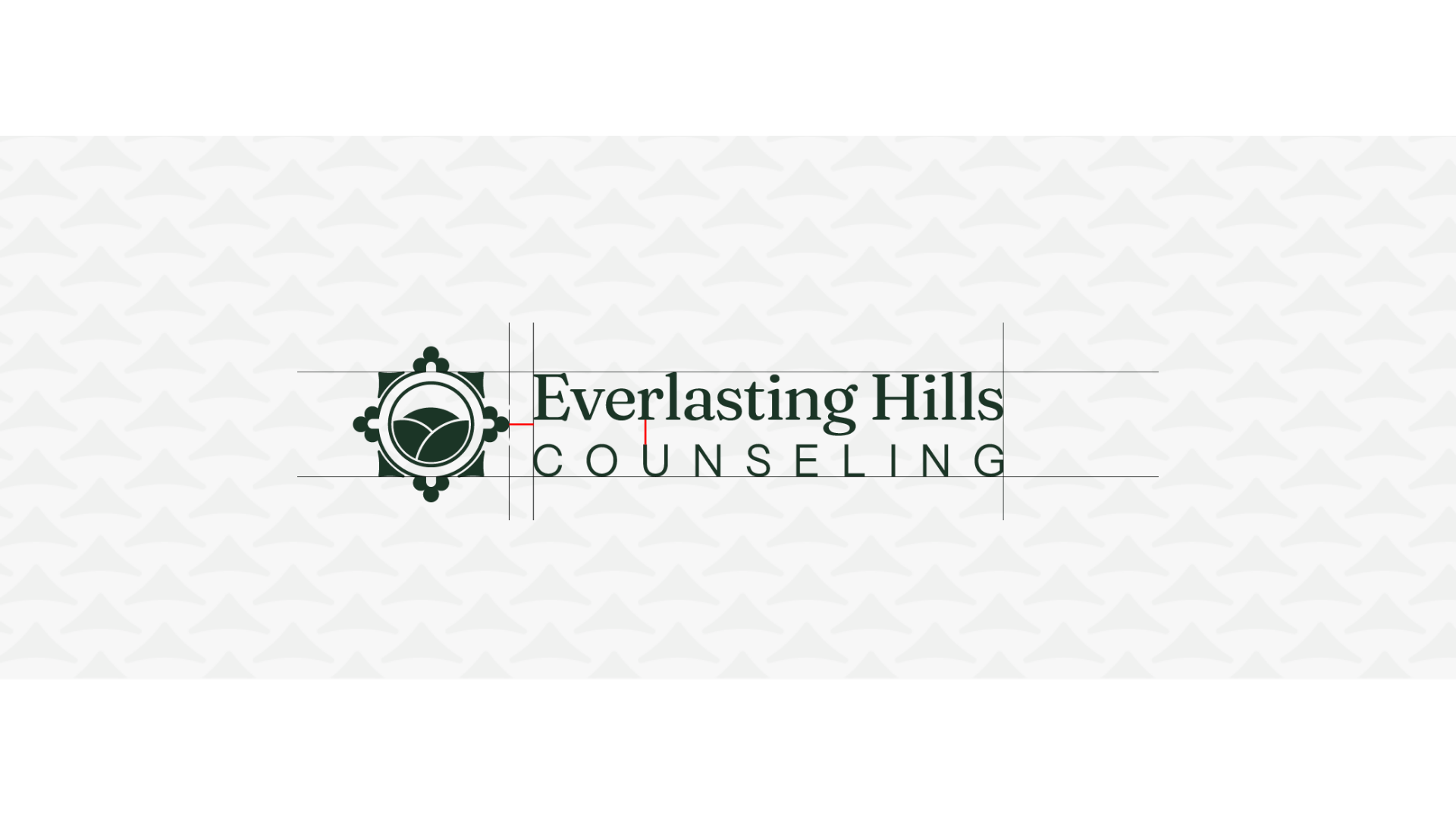
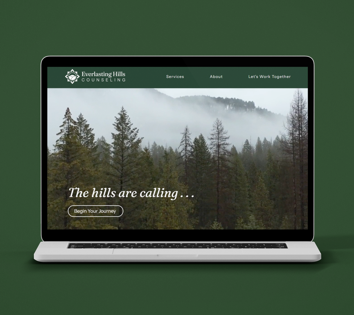
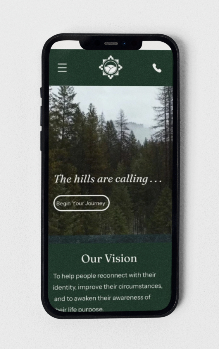
I designed the practice's website so the brand carries through to the first place many clients will see it. It uses the same colors, type, and symbols as the rest of the brand kit.
VISIT EVERLASTING HILLS WEBSITE ↗