CONTACT
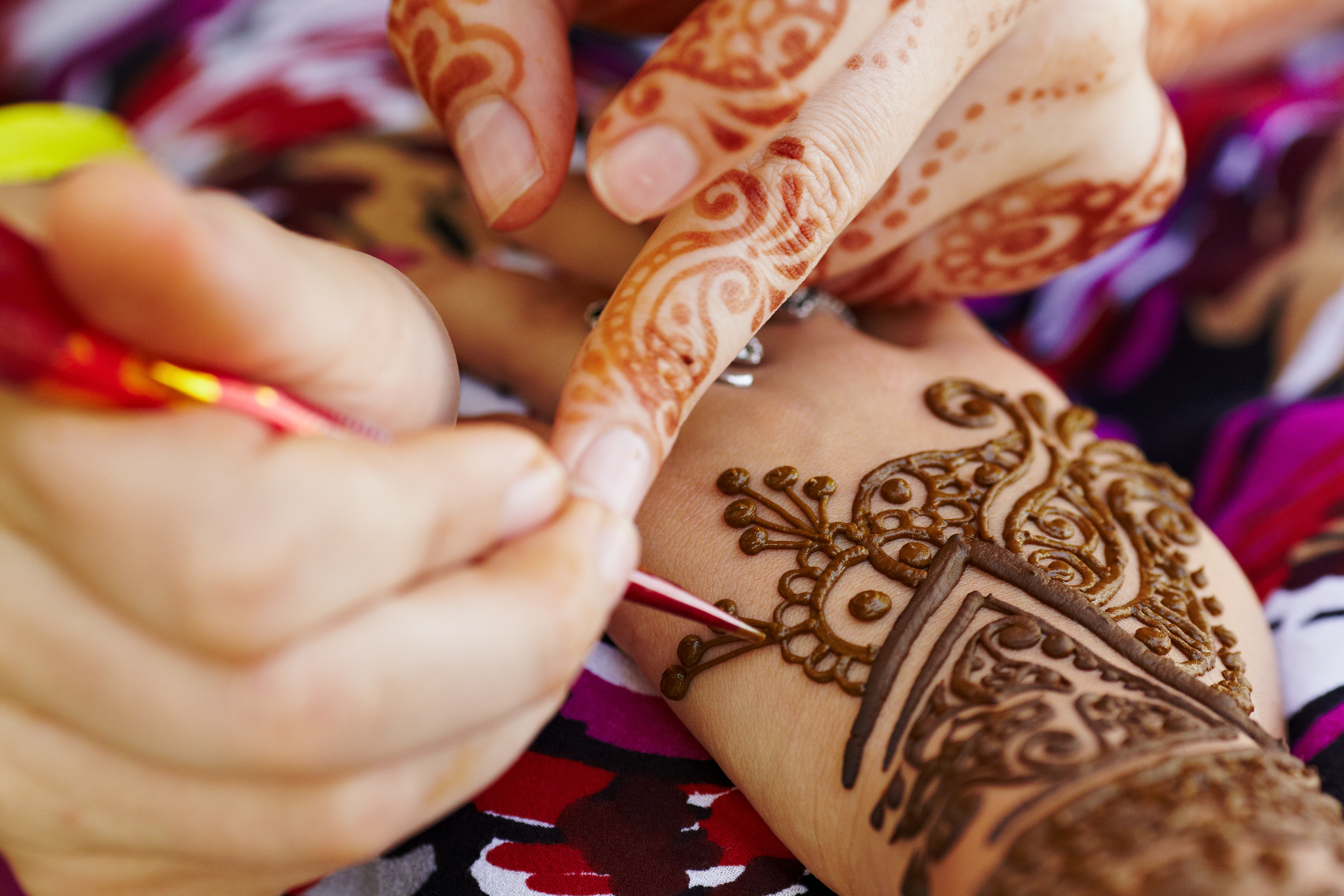
Pakistani
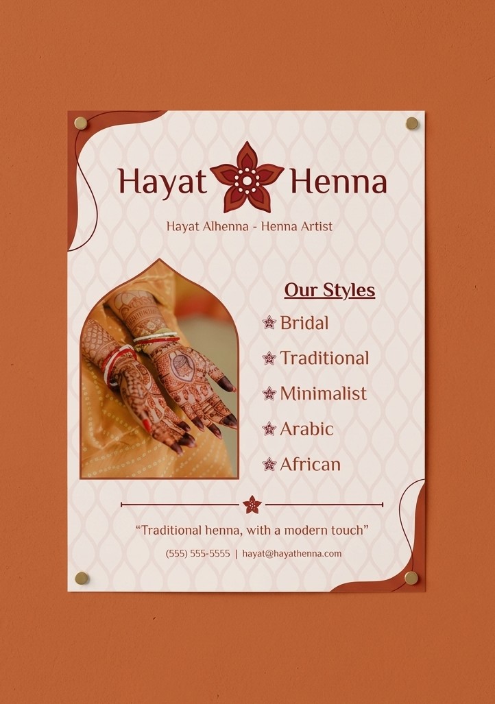
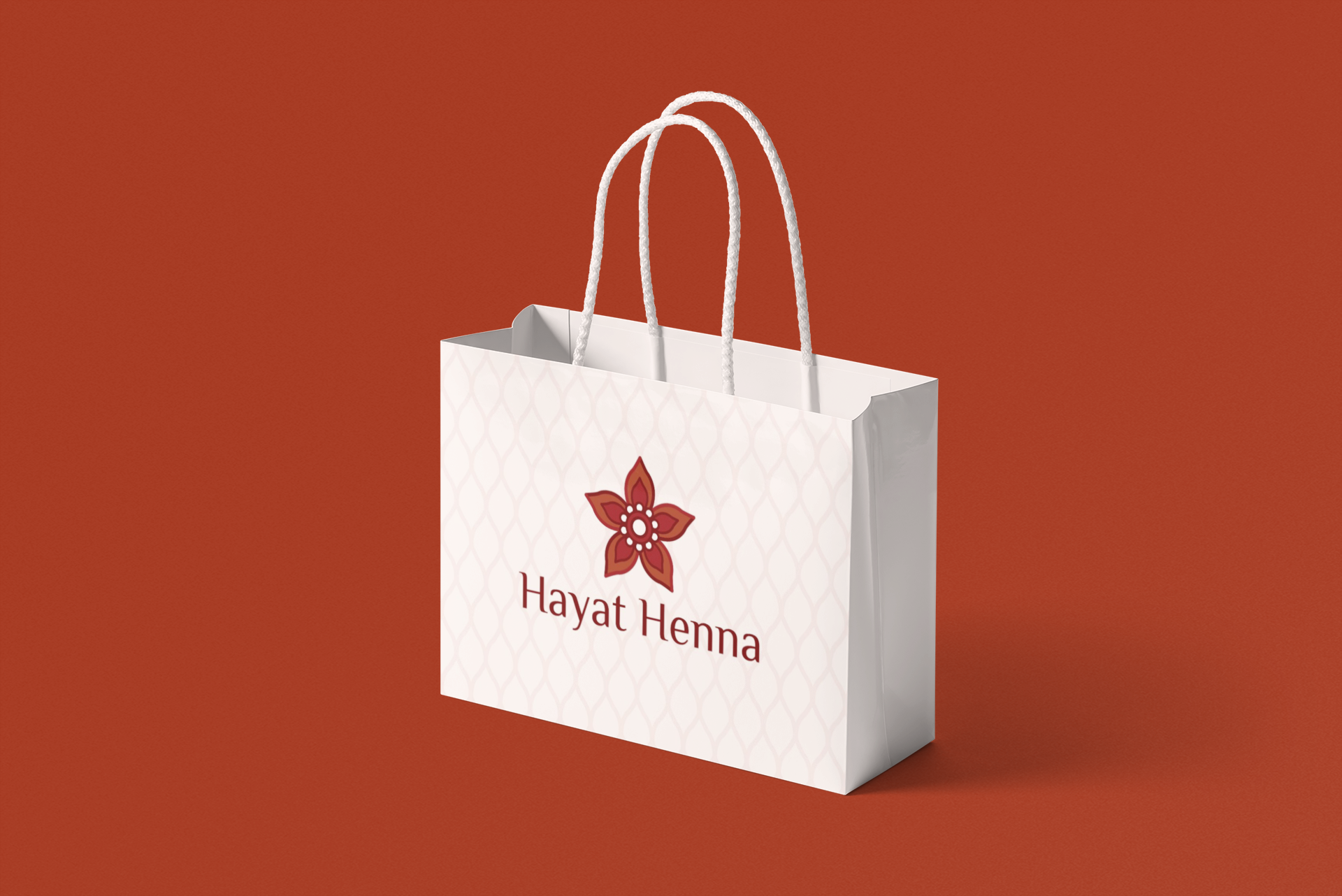
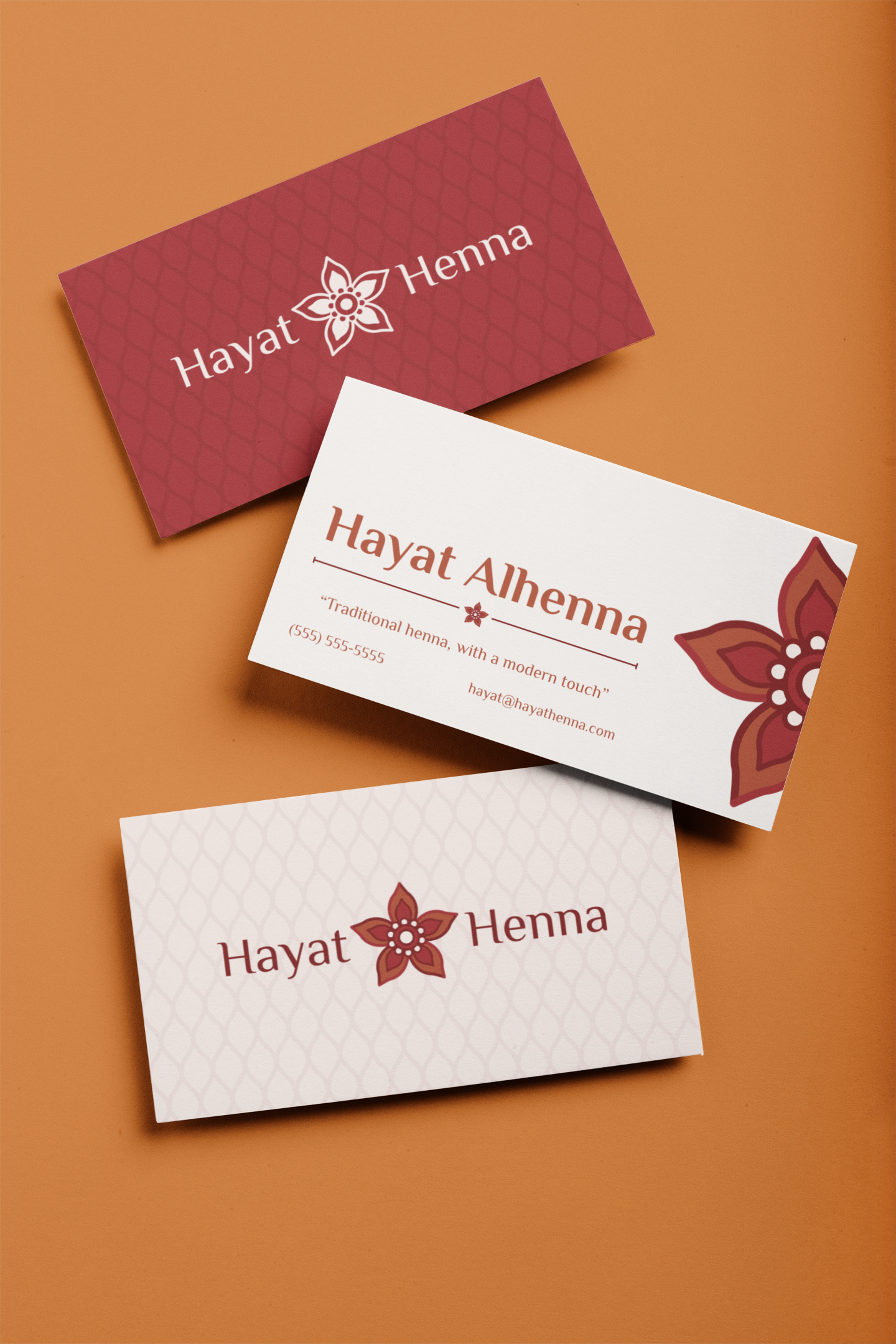
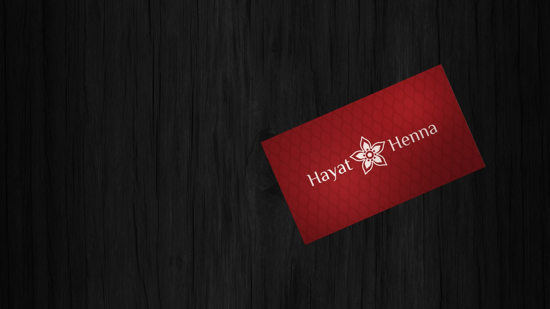
Hayat Henna is a concept brand for a Pakistani-owned henna studio. The idea behind it is traditional henna, with a modern touch. I kept the heritage of the craft and gave it a cleaner, more current look, so the brand feels rooted and fresh at the same time.
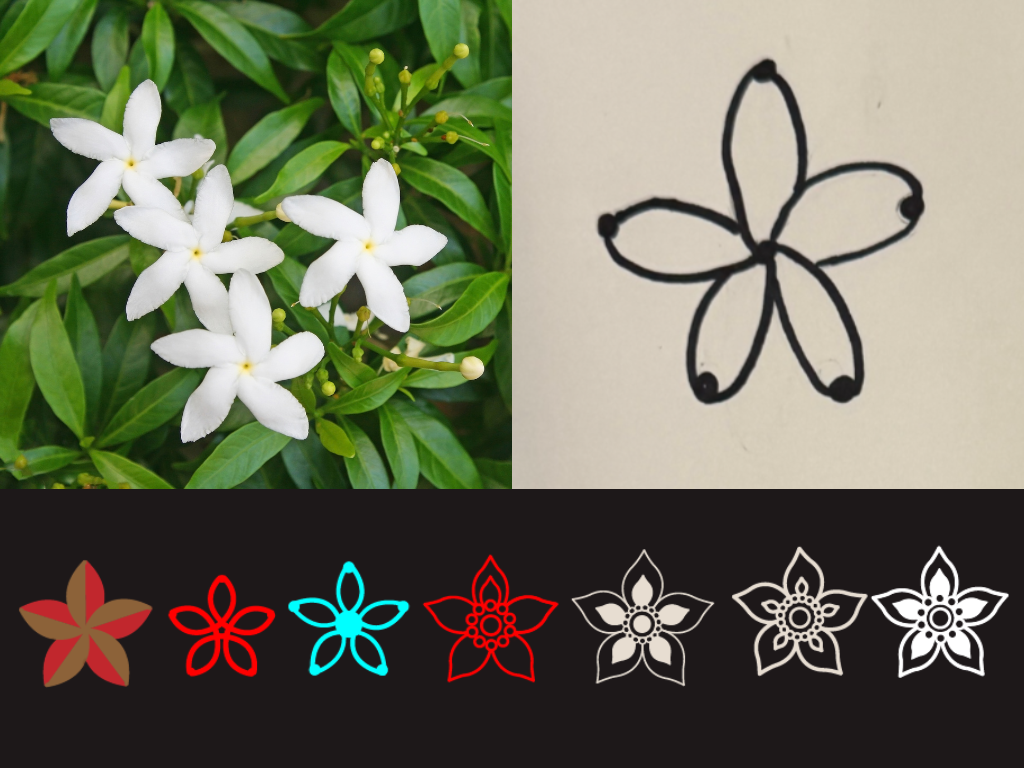
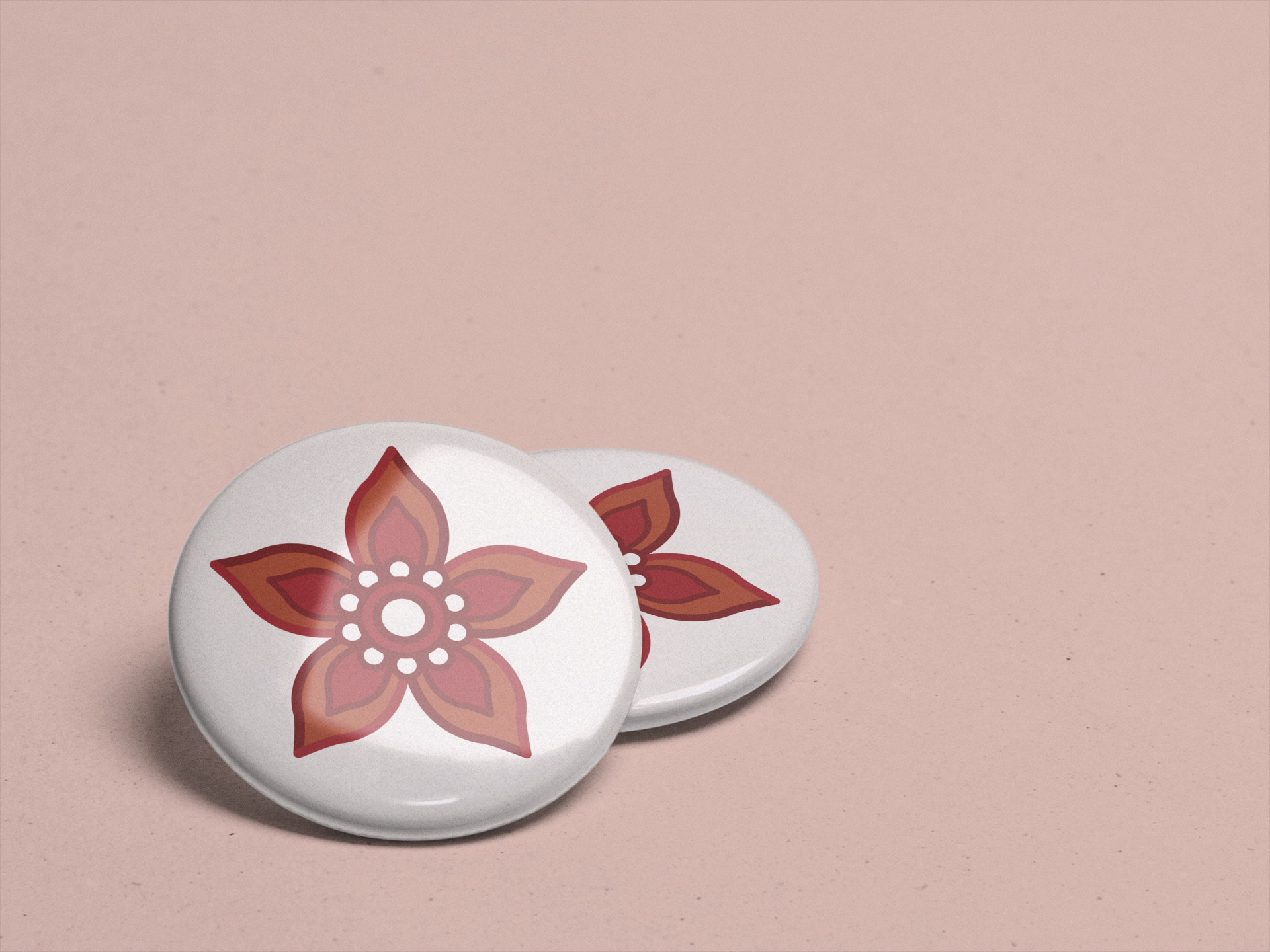
The icon is a jasmine flower, Pakistan's national flower, so the brand carries its roots in the mark itself. I kept the shapes simple, with five petals around a dotted center, so it works large on a flyer or small on a profile picture and is easy to recognize either way.
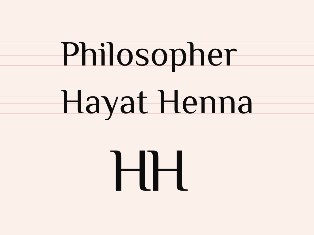
The type is simple, with a little sophistication. It's easy to read on a flyer, a business card, or an Instagram post, and the soft curves give it enough grace to feel elegant without getting fussy. It lets the henna designs be the star while the brand still looks polished.
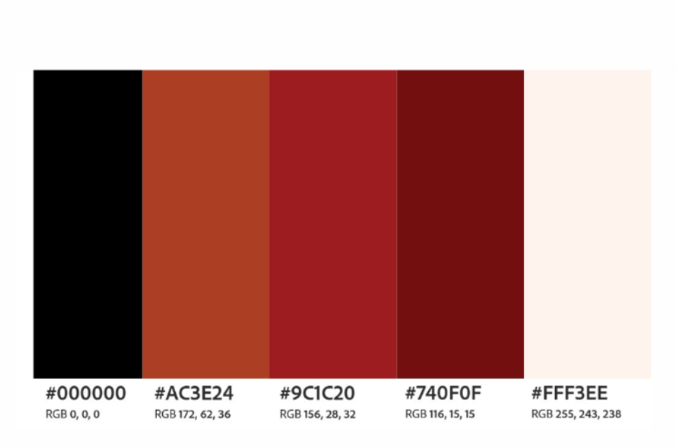
The palette comes straight from henna. The deep reddish-brown is the color of dried henna on the skin, the warm terracotta is earthy and warm, and the soft cream is a calm backdrop that lets both stand out. Together they feel natural and a little celebratory, which fits the weddings and festivals henna is made for.
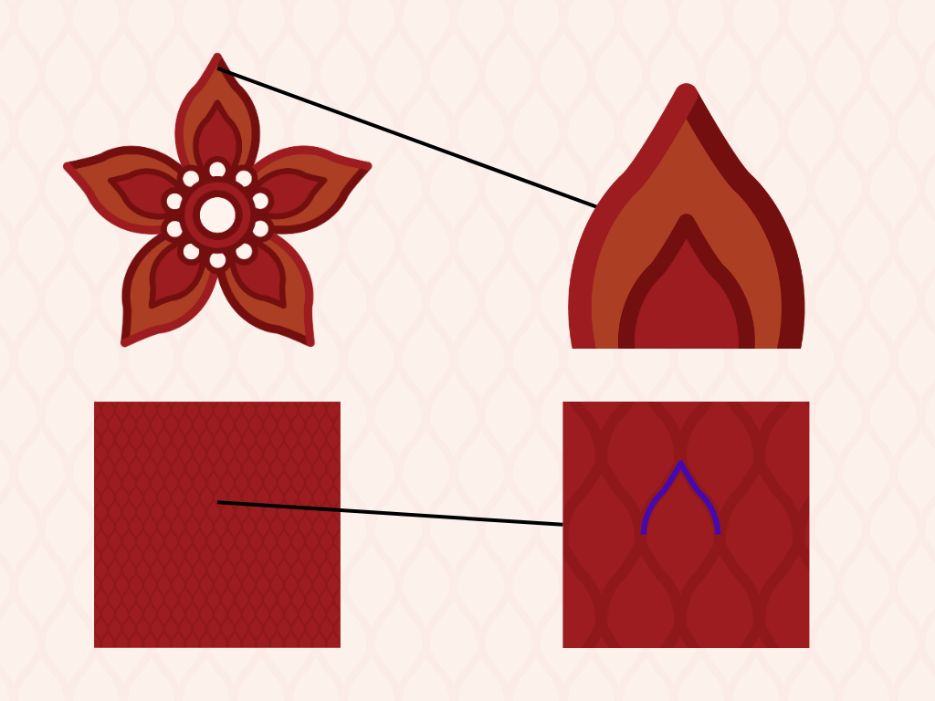
Reminiscent of traditional henna patterns, the petal symbolizes beauty and cultural heritage, as well as arches found in Islamic architecture.